
Custom Blocks
This state template also includes custom blocks that have been created to provide specific content modules for the State of Hawaii agencies.
Home vs. Sub Pages
It is worth noting that the custom blocks on the home page appear slightly differently than they do when brought into other pages of the website. This is because, as mentioned before, the home page is a full width page, whereas other pages have a specific width for the content container. However, all blocks are available for any given page, even though the presentation of the blocks may differ slightly from the home page to the rest of the site.
Custom Blocks
The following are the custom blocks available for use on the home page:
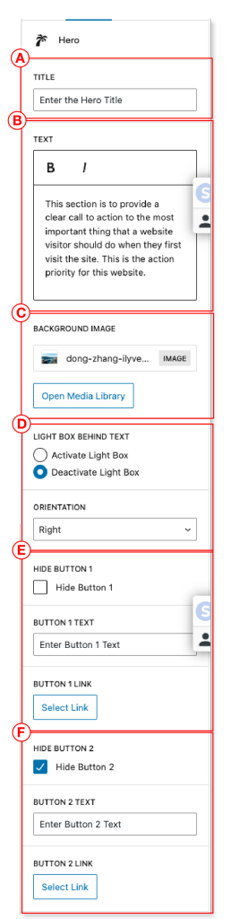
Hero
The hero block is a wide section with a background image with a title, body text and up to two call to action buttons. Each of the lettered areas are editable from the block editor.
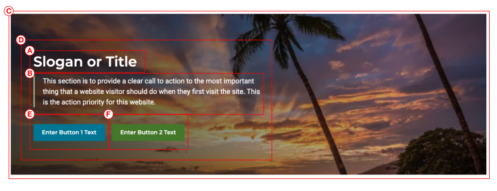
Within the block editor you can make the following changes/adjustments:
- A. Title
- B. Description Text
- C. Background Image
- D. Content Container
- Dark / Light
- Alignment / Orientation
- E. Button 1 (optional)
- F. Button 2 (optional)
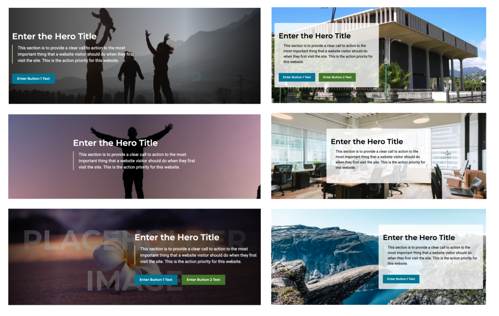
Hero Examples
There are many different ways to configure your hero block. Here are some examples of different looks that can be accomplished with the hero block.
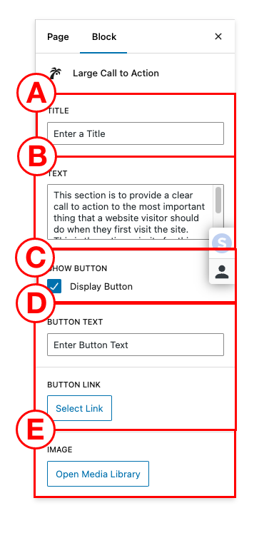
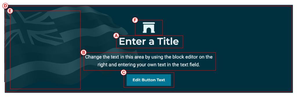
Large Call to Action
This is a single call to action, meant to emphasize the most important action a user can make on the website. Each of the lettered areas are editable from the block editor.
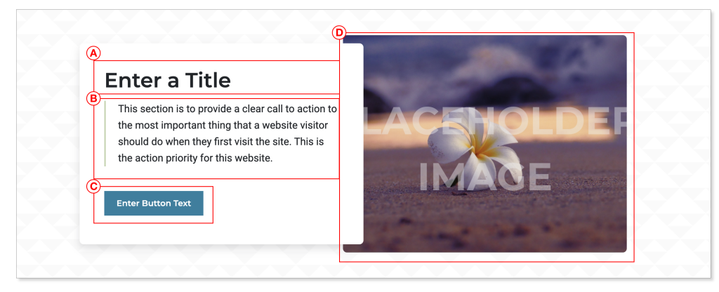
Within the block editor you can edit them as follows:
- A. Title
- B. Text
- C. Show Button Toggle
- D. Button text and link
- E. Image
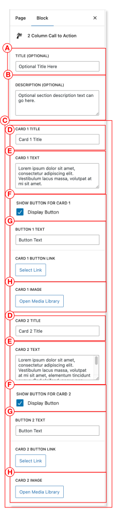
2 Column Call to Action
This block puts a two-column / two card call to action section on your page. Each of the lettered areas are editable from the block editor.
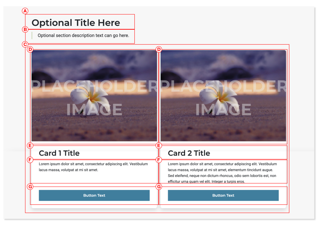
Within the block editor you can edit them as follows:
- A. Title
- B. Text (optional)
- C. Cards
- D. Card title
- E. Card description text
- F. Card button toggle
- G. Card button text and link
- H. Card Image
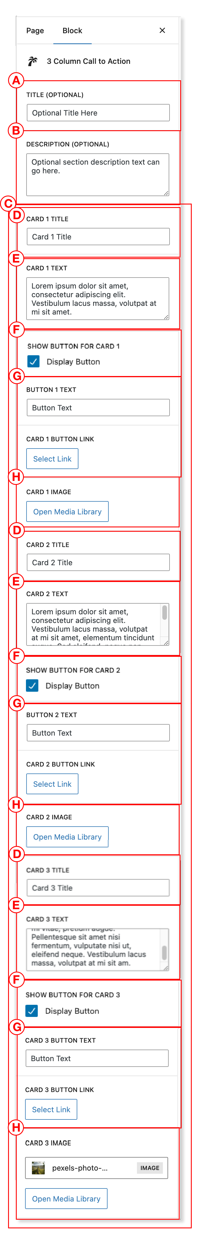
3 Column Call to Action
This block puts a three-column / three card call to action section on your page. Each of the lettered areas are editable from the block editor.
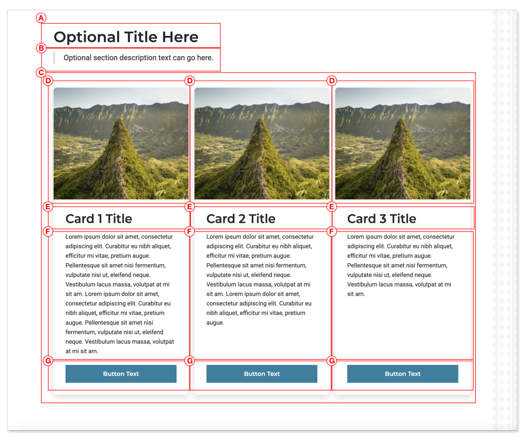
Within the block editor you can edit them as follows:
- A. Title
- B. Text (optional)
- C. Cards
- D. Card title
- E. Card description text
- F. Card button toggle
- G. Card button text and link
- H. Card image
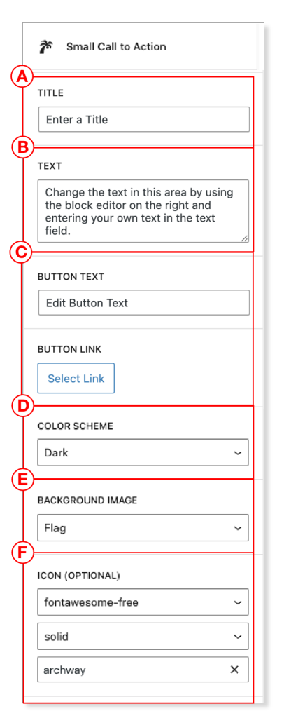
Small Call to Action
This block allows you to create a small call to action section with a Hawaiian flag background to link to a single call to action. Each of the lettered areas are editable from the block editor, and includes options to change from light to dark mode, change the image in the background of the block, add an optional icon above the title, and edit any of the other text fields and buttons in the block.
Within the block editor you can edit them as follows:
- A. Title
- B. Text
- C. Button
- D. Color Scheme
- E. Background Image
- F. Icon (Optional)
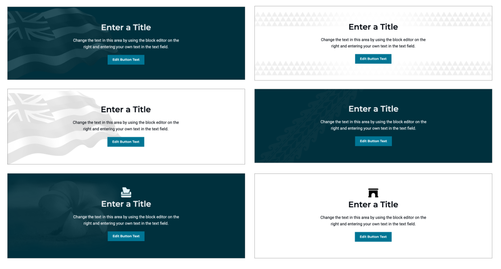
Small CTA Examples
There are many different ways to configure your small CTA block. Here are some examples of different looks that can be accomplished with this block.
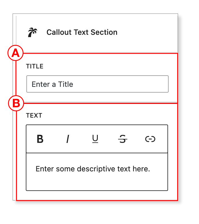
Callout Text Section
This custom block let’s you add a callout with extensive text. You can edit the text using a WYSIWYG editor which allows you to include links and format text (bold, italics, etc.).
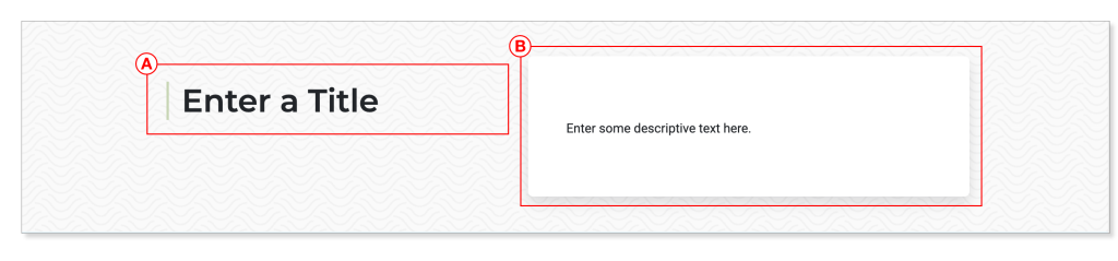
Within the block editor you can edit them as follows:
- A. Title
- B. Text
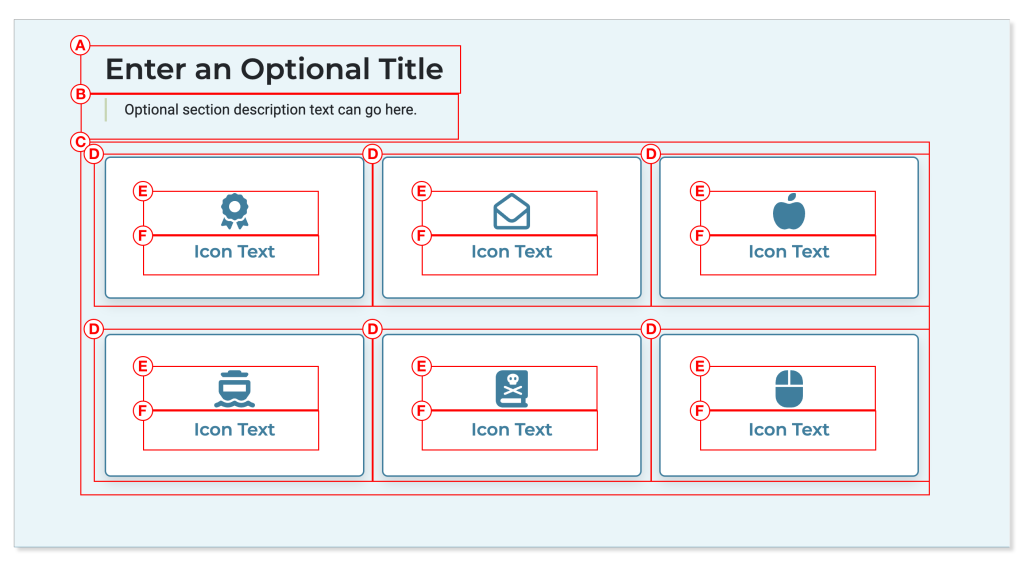
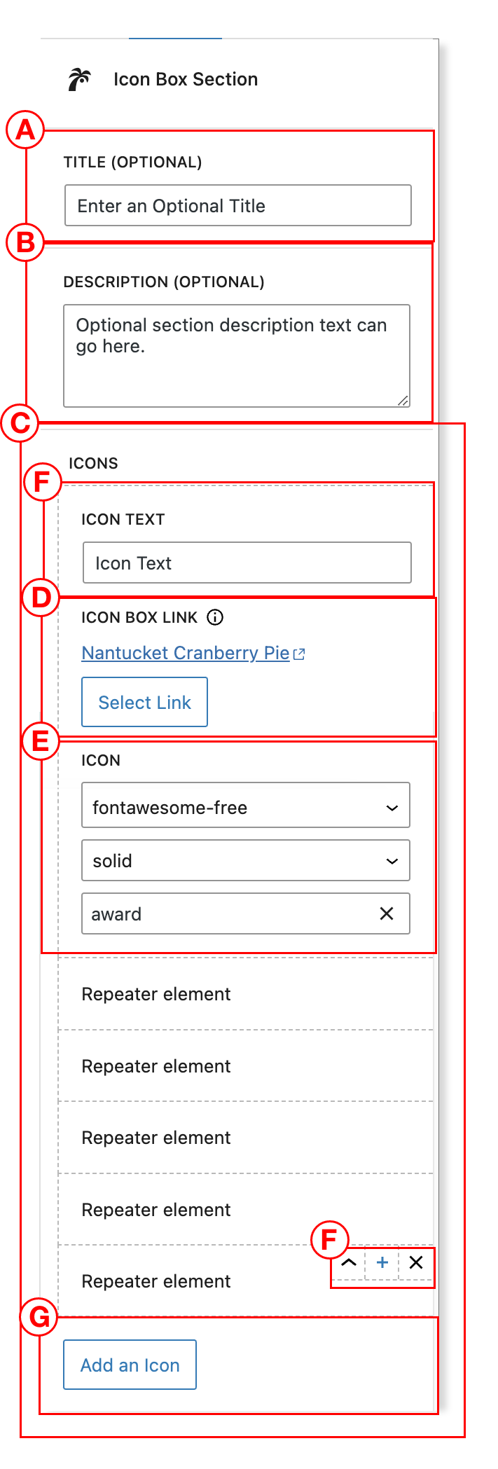
Icon Box Section
This block is a section with icon boxes, each including an icon image, a title, and a link for the specified icon box.
Within the block editor you can edit them as follows:
- A. Title
- B. Text (optional)
- C. Icon box sections
- D. Icon box
- E. Icon image
- F. Icon text
- D. Icon box
You can also add as many icon boxes as you like, up to 9 icon boxes. To add a new icon box just click the “Add an icon” button (G). You can also collapse the existing icon boxes to make the editing experience easier. Just click the toggle switches (F) to either expand/collapse an icon, add a new icon box, or delete the icon box from the block.
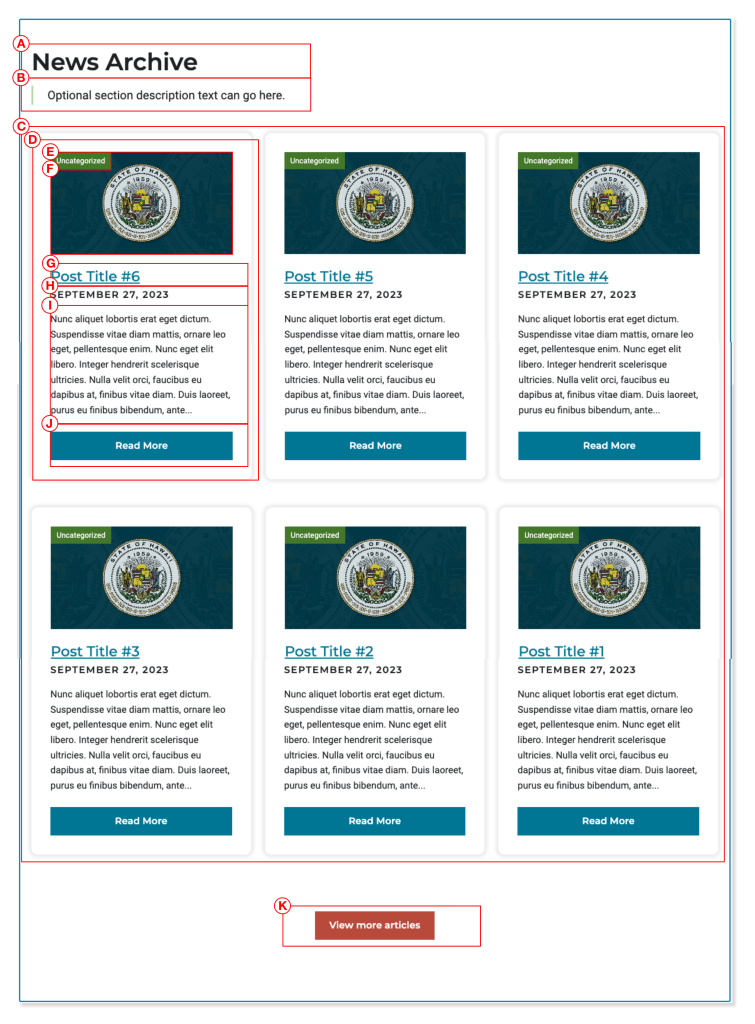
News Archive
With this custom block you can add in a news archive custom block that brings in between 3 or 6 of the most recent news posts from your website. It also allows to display an optional selection of specific news post categories, and if you have featured images set up for your posts, they can be set to display using a toggle switch in the block admin area.
Here are the various parts of the news archive block:
- A. Section Title
- B. Optional Description
- C. Post Archive Cards
- D. Post Archive Cardf
- E. Optional Category Name
- F. Optional Featured Image
- G. Post Title
- H. Post Date
- I. Post Excerpt
- J. Post Button
- K. Section Button
The following options are available in the block editor:
- A. Title
- B. Description (optional)
- C. The number of posts to show (3 to 6)
- D. Category (all, or a specific category selection)
- E. Featured Image toggle
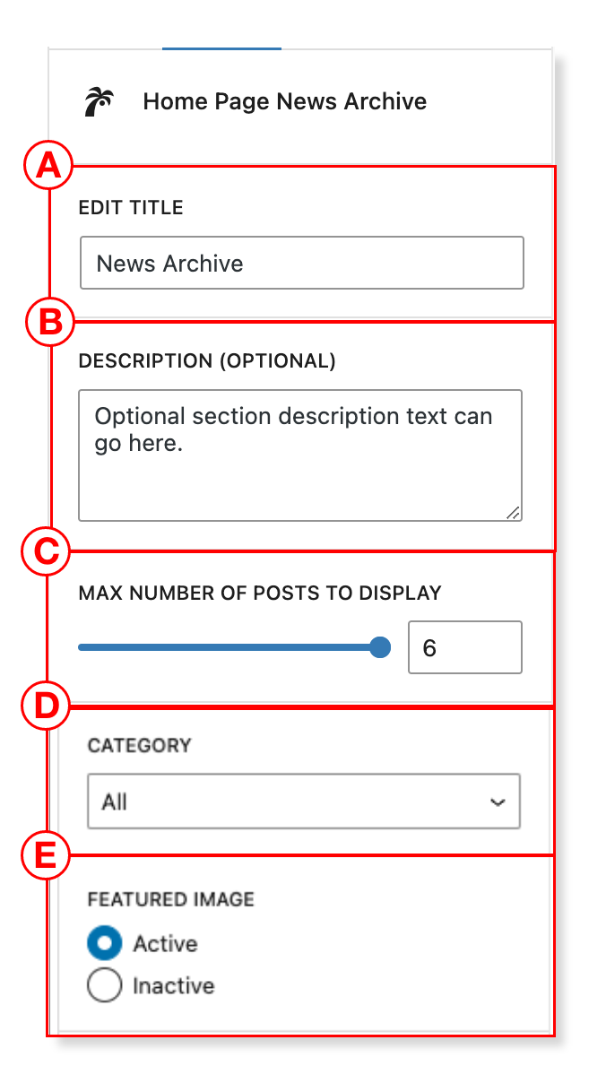
The posts display in reverse chronological order, with the most recent one in the top left position.
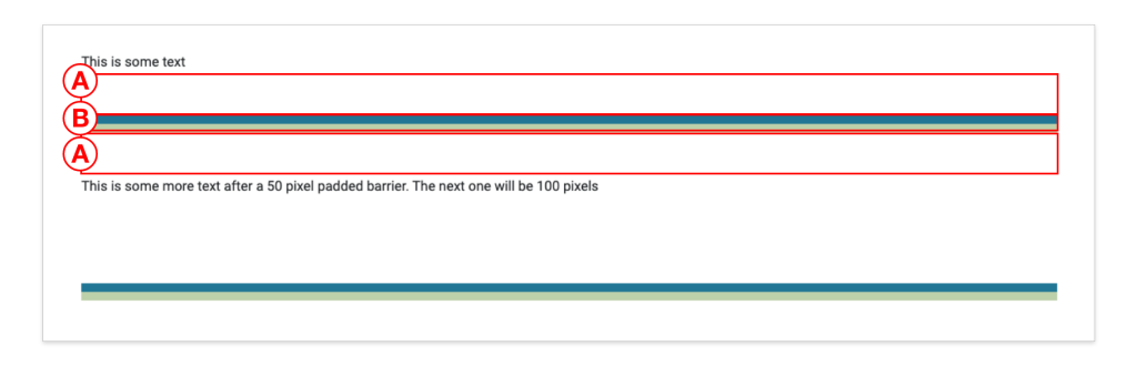
Block Divider
This block provides space and a dividing line that you can use to separate content on the page. It allows for a custom padding on the top and bottom of the colored dividing line.
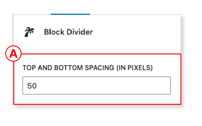
Here are the parts of the block:
This block has just one adjustable option, which is the padding:
- A. Top and Bottom Padding (in pixels)
There is no specific limit for the padding, but generally you shouldn’t need to have more than 50 to 100 pixels of padding above or below.